Santana’s — Restaurant Communication
At Boss Marketing, I created a consistent set of restaurant visuals for Santana’s across social posts, Stories and a delivery packaging concept.
Explore the projectBrief & contribution
The restaurant needed to communicate offers, menu items, opening hours and delivery without treating every post as a separate campaign. I developed the layouts and adapted the visual language to digital and packaging formats at Boss Marketing.
One recognizable visual language
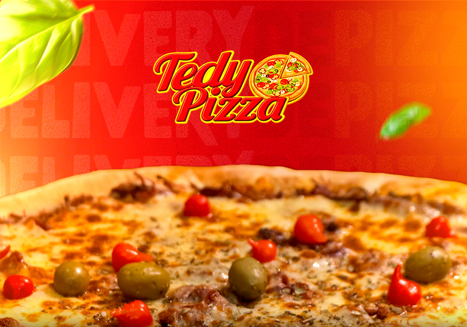
Warm orange, prominent typography, food imagery and the restaurant’s mark create a consistent presence. The three-part artwork introduces the range of the offer, the product and the delivery service.
A three-part introduction
The wide opening image resolves into its three original panels.
The triptych
Restaurant, product and delivery
Physical application
Kraft delivery packaging.
From packaging to daily communication
The kraft bag mockup extends the visual language to a physical touchpoint. On social media, the system adapts to product-led posts, people, promotions and practical information.
Stories for every part of the menu
Ten original story layouts in a consistent identity.
Restaurant stories
Browse all ten pieces
Outcome & application
The work brings a three-panel campaign, ten Stories and a kraft bag application under one recognizable visual direction. It can handle both promotional messages and everyday service information.